Front page

Front page

Front page

Product Design

UX/UI Design

Rapid Prototyping

Facilitating Co-creation Sessions

Designing under uncertainty

When a major change was announced for the game ecosystem, the exact mechanics and user implications were still evolving. Rather than waiting for complete information, we identified an opportunity to explore how the change could create value for our users.

My role was to rapidly translate uncertainty into a flexible product experience that could evolve alongside the feature itself.

Within five days, we designed, built, and launched the first iteration.

Shipped from concept to production in 5 days

Quickly became one of the platform’s most-used new features

Achieved an average session duration of over 6 minutes

01 Challenge

Product teams rarely have complete information before they begin building.

In this project, many of the underlying requirements were still evolving, making it impossible to optimise for a fixed set of rules from the outset.

Instead of waiting for certainty, the challenge was to identify which assumptions mattered most, create value with the information available, and design an experience that could adapt as the product matured. This raised a key question:

How might we create a product experience that delivers value today while remaining flexible enough to evolve tomorrow?

02 Process

Framing the unknown

Before exploring solutions, we identified which assumptions were essential to the experience and which could safely evolve later. This allowed us to move forward without waiting for complete certainty.

Rather than designing around fixed requirements, we designed around user needs that were unlikely to change.

Rapid prototyping

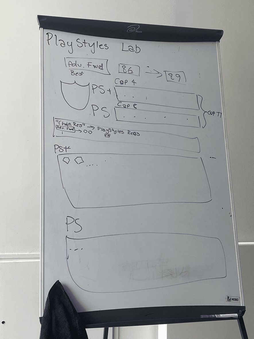
After sketching the core flow on a whiteboard, we moved into Figma to explore both the desktop and mobile experience.


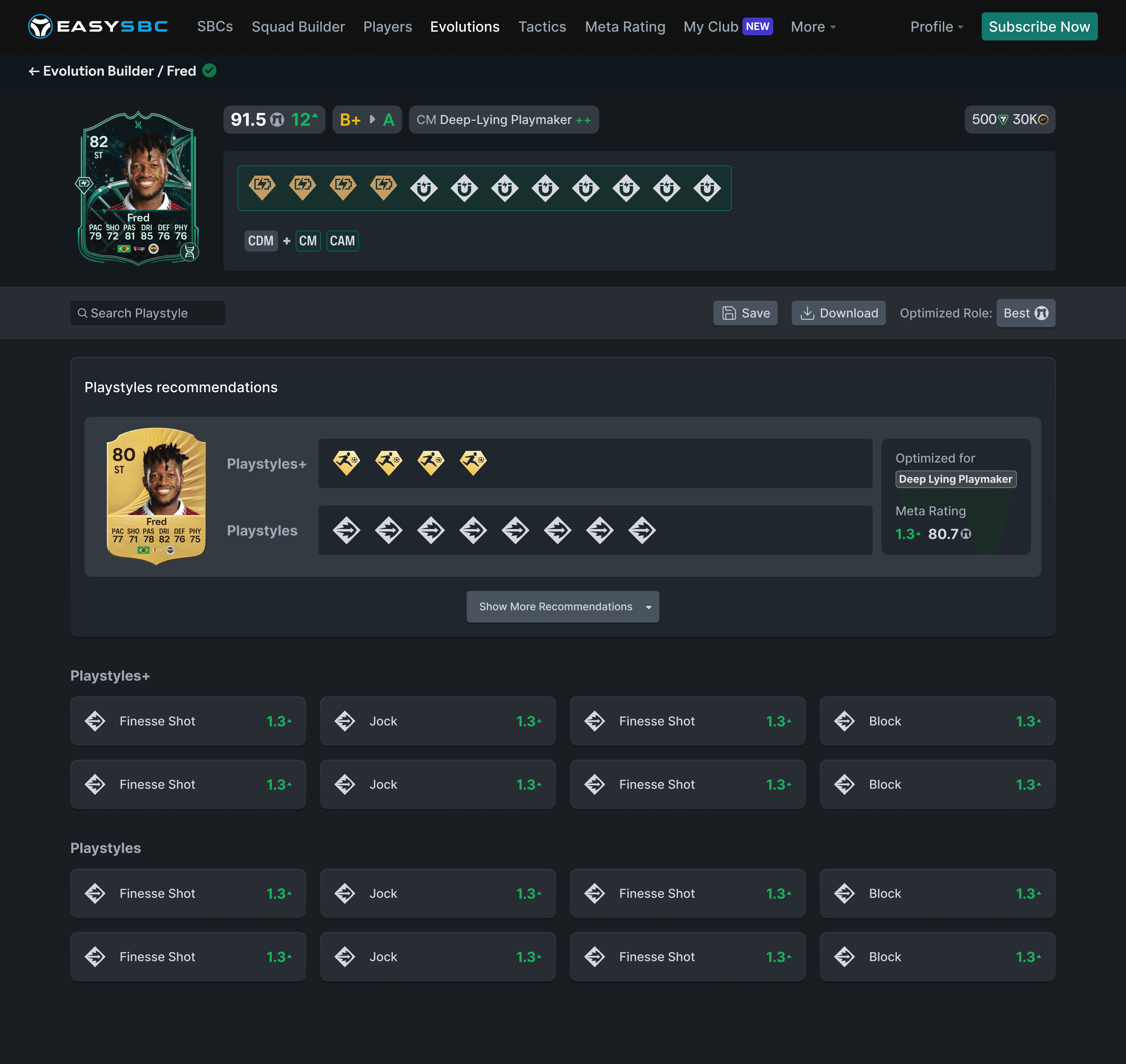
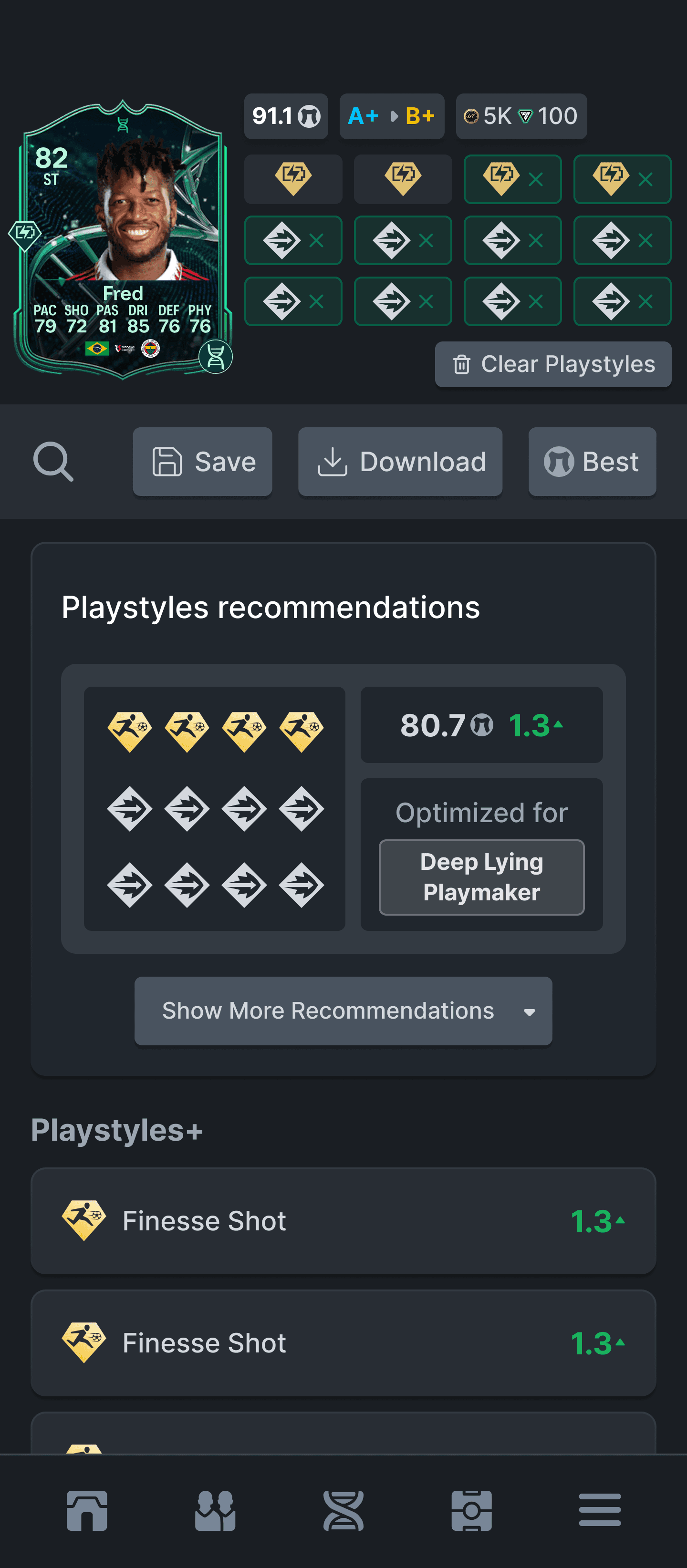
This helped us understand how the feature should adapt across screen sizes. Desktop gave us room to show more information and comparisons at once, while mobile required a more focused and scannable flow.

Rapid prototyping

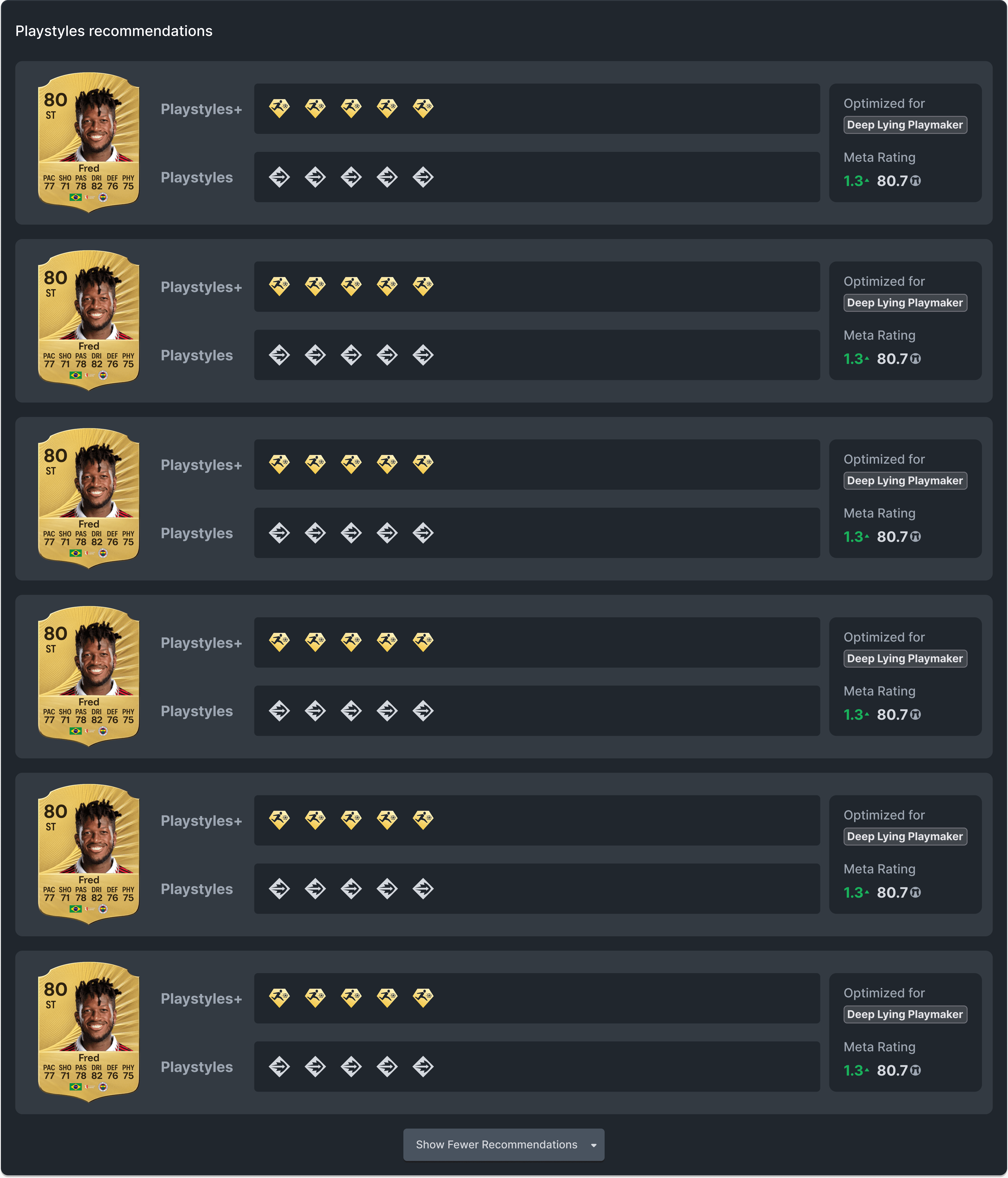
One of the core parts of the feature was playstyle recommendations. Instead of asking users to manually compare every possible combination, we wanted the tool to calculate which playstyle combos made the most sense for a specific player role.


The recommendations showed which combinations produced the highest meta rating gain, making it easier for users to understand not just what they could choose, but what would actually improve the player the most.


This was especially important because playstyles can quickly become difficult to evaluate in isolation. A single playstyle might look useful on its own, but the real value often depends on the player’s position, role, stats, and how the combination affects their overall in-game performance.

03 Outcome

The first version was designed, built, and released within five days.

Early engagement suggested that the feature resonated with users, quickly becoming one of the platform’s most actively used new experiences.

Highlights

  • 5 days from concept to launch

  • 6+ minutes average session duration

  • Strong early user engagement

While these early indicators were encouraging, they also marked the beginning rather than the end of the design process. The next step would be to validate assumptions through user research, identify remaining friction points, and continue iterating based on user behaviour.

04 Reflections

This project reinforced an important lesson for me: product teams rarely have complete information before they begin building.


Rather than waiting for certainty, the challenge is to identify which assumptions matter most, create value with the information available, and design solutions that can evolve as new requirements emerge.


It also reminded me that speed and quality are not necessarily competing priorities. Moving quickly is not about skipping the design process—it is about reducing uncertainty through rapid alignment, prototyping, and continuous iteration.


Finally, the project highlighted that good product design is not just about giving users more options. It is about helping them make better decisions with confidence by presenting complexity in a way that feels understandable and actionable.

02 Process

Lo-fi sketches

We kicked off our brainstorm session by sketching on a white board. At this point we suspected the feature would work a lot like the evolutions concept. This lo-fi sketch aligned us and gave me enough context to start wireframing in Figma.

Sketching the desktop and mobile version in Figma

After sketching the core flow on a whiteboard, we moved into Figma to explore both the desktop and mobile experience.


This helped us understand how the feature should adapt across screen sizes. Desktop gave us room to show more information and comparisons at once, while mobile required a more focused and scannable flow.

Making it easy for the user to choose playstyle combinations

One of the core parts of the feature was playstyle recommendations. Instead of asking users to manually compare every possible combination, we wanted the tool to calculate which playstyle combos made the most sense for a specific player role.


The recommendations showed which combinations produced the highest meta rating gain, making it easier for users to understand not just what they could choose, but what would actually improve the player the most.


This was especially important because playstyles can quickly become difficult to evaluate in isolation. A single playstyle might look useful on its own, but the real value often depends on the player’s position, role, stats, and how the combination affects their overall in-game performance.

03 Outcome

The first version was designed, built, and released within five days.

Early engagement suggested that the feature resonated with users, quickly becoming one of the platform’s most actively used new experiences.

Highlights

  • 5 days from concept to launch

  • 6+ minutes average session duration

  • Strong early user engagement

While these early indicators were encouraging, they also marked the beginning rather than the end of the design process. The next step would be to validate assumptions through user research, identify remaining friction points, and continue iterating based on user behaviour.

04 Reflections

This project reinforced an important lesson for me: product teams rarely have complete information before they begin building.


Rather than waiting for certainty, the challenge is to identify which assumptions matter most, create value with the information available, and design solutions that can evolve as new requirements emerge.


It also reminded me that speed and quality are not necessarily competing priorities. Moving quickly is not about skipping the design process—it is about reducing uncertainty through rapid alignment, prototyping, and continuous iteration.


Finally, the project highlighted that good product design is not just about giving users more options. It is about helping them make better decisions with confidence by presenting complexity in a way that feels understandable and actionable.

Create a free website with Framer, the website builder loved by startups, designers and agencies.